
Mobile-First Design: How to Fix the Version of Your Site Most People See

Here is a test worth doing before reading any further. Take out your phone, turn off wifi, and open your own website on mobile data. Count the seconds until you can actually read something.
Most business owners have never done this. They look at their site on a laptop, on office broadband, with the browser cached from the last twenty visits. That version of the site is fast, roomy and fine. It is also not the version most of their customers ever see.
Around three-quarters of web traffic in India is on a phone, and for local searches it is higher still. The real experience is a mid-range Android on a patchy 4G connection. Mobile-first design means designing for that, rather than designing for a desktop and hoping it survives the trip down.
What's in this guide
- 1What mobile-first actually means
- 2Why this is not just a design preference
- 3Core Web Vitals: the three numbers
- 4Eight mobile mistakes to check today
- 5Speed: what actually slows an Indian site down
- 6Designing for thumbs, not cursors
- 7Forms and contact on a small screen
- 8How to test properly
- 9A fix list in priority order
- 10A worked example: a coaching institute
- 11Frequently asked questions
What mobile-first actually means
Most people use 'responsive' and 'mobile-first' as if they mean the same thing. They do not, and the difference shows up in the finished site.
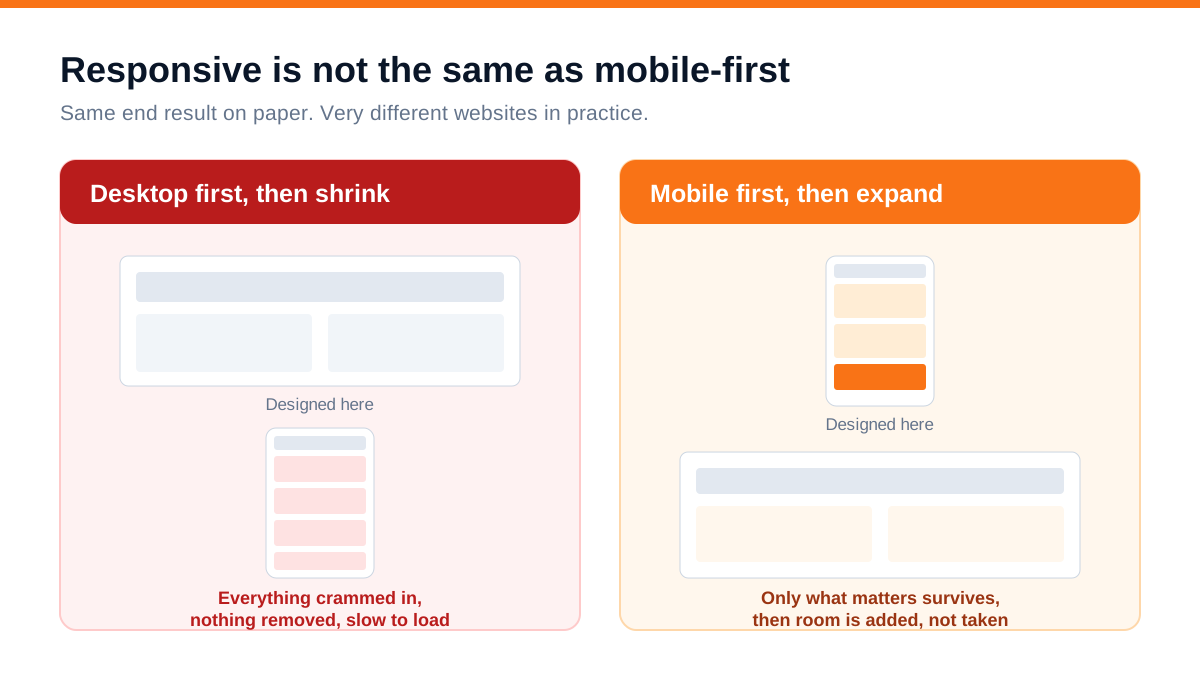
Responsive means the layout adapts to screen size. A desktop design is built first, then squeezed and rearranged for smaller screens. Nothing gets removed - it all still loads, it just stacks. The result works, technically, and is usually slow and cluttered on a phone.
Mobile-first means the small screen is designed first, with only what genuinely matters. Then, as the screen gets bigger, you add space and secondary elements. Because you started with constraints, the phone version is not a compromise; it is the primary design.
The practical consequence is what gets cut. Designing desktop-first, everything on the page has to go somewhere on mobile, so it all ends up stacked in a long scroll. Designing mobile-first forces the question 'does this earn its place' on every element, and most pages get better for it on every screen size.
This is not only a philosophy. Google indexes and ranks using the mobile version of your site. If your mobile version has less content, hidden text or missing links, that is what gets judged - the desktop version is essentially ignored.
Why this is not just a design preference
Four concrete reasons this affects revenue rather than only aesthetics.
Mobile-first indexing. Google evaluates the mobile version. A site with content hidden behind mobile accordions or stripped out of the mobile layout ranks on what remains.
Speed is a ranking factor, and a much larger conversion factor. Every additional second before a page becomes usable costs conversions, and the effect is steepest in the first few seconds. The ranking impact is modest; the sales impact is not.
Local search is overwhelmingly mobile. Somebody looking for a supplier, clinic or workshop nearby is doing it on a phone, often while moving. If your page is slow or hard to use, they simply return to results and tap the next one. This is why mobile experience and local SEO are the same project in practice.
Paid traffic is mostly mobile too. If you run ads, the majority of clicks land on phones. A slow mobile site means you are paying full price for clicks that leave before the page appears - which is one of the quieter ways ad budgets get wasted.
Core Web Vitals: the three numbers
Google publishes three measurements of real user experience. They are worth understanding because they translate directly into things you can fix.
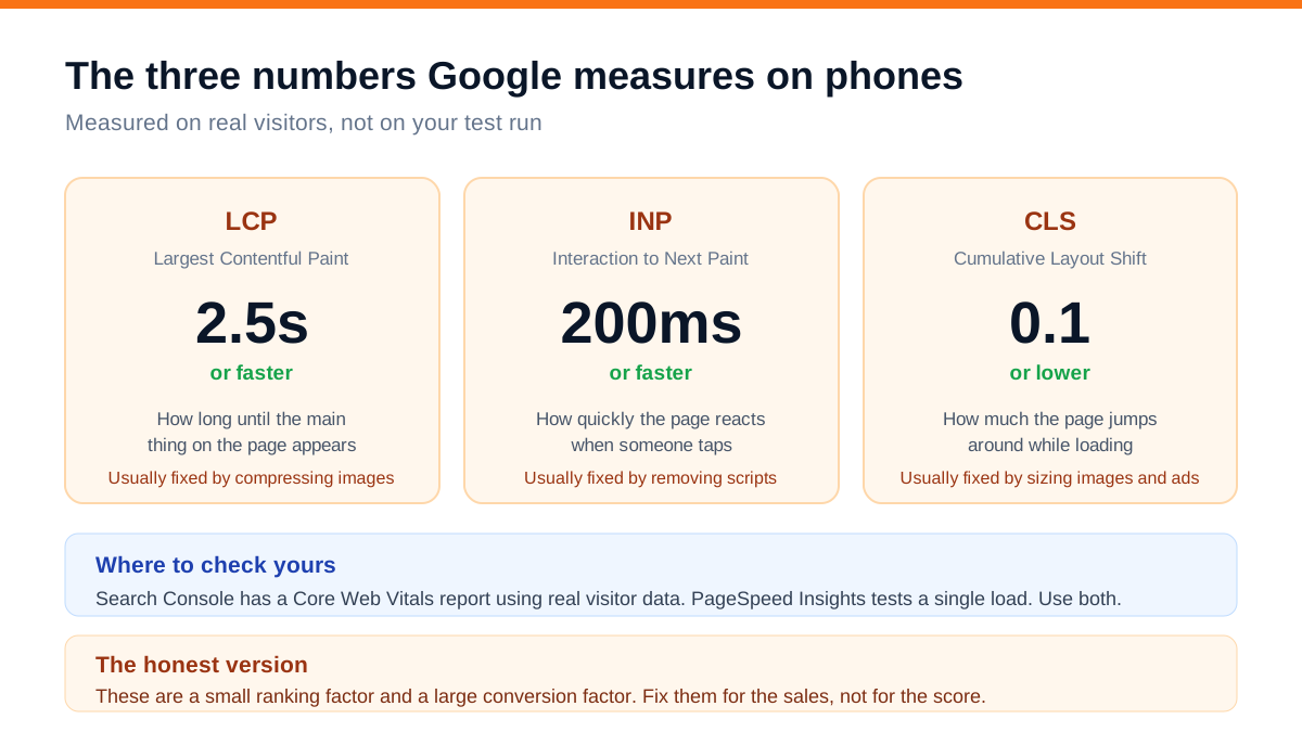
LCP - Largest Contentful Paint - target 2.5 seconds or less. How long until the main thing on the page appears. On small business sites this is almost always an oversized hero image, and compressing it fixes most of the problem.
INP - Interaction to Next Paint - target 200 milliseconds or less. How quickly the page responds when someone taps. Poor scores usually mean too much JavaScript - chat widgets, tracking scripts, animation libraries, unused plugins.
CLS - Cumulative Layout Shift - target 0.1 or less. How much the page jumps around while loading. Caused by images without width and height set, ads and banners inserted after load, and popups appearing on arrival. It is the most irritating one for users, because it makes people tap the wrong thing.
Check yours in two places: Search Console has a Core Web Vitals report built from real visitor data, which is the one that counts; PageSpeed Insights tests a single load and is useful for diagnosing specific problems. Use both, and trust Search Console when they disagree.
An honest note: these are a small ranking factor. Businesses that obsess over reaching a perfect score are usually optimising the wrong thing. Fix them because a site that loads in two seconds sells more than one that loads in seven, not because of the number.
Eight mobile mistakes to check today
These are the issues we find on the large majority of Indian small business sites.
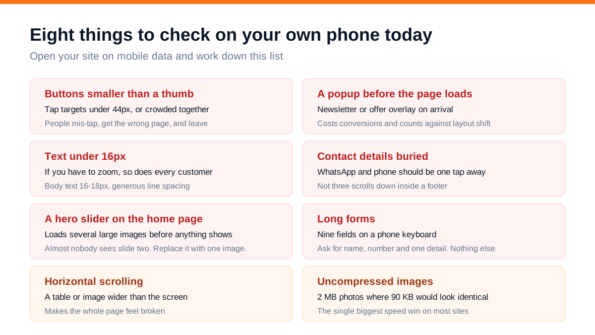
The two worth singling out:
The home page slider. Almost every template ships with one, and it is nearly always the single biggest cause of slow loading. It downloads several large images before anything appears, and analytics consistently show that hardly anyone sees past the first slide. Replace it with one well-compressed image and a clear headline.
The immediate popup. A newsletter or offer overlay that appears before someone has read anything is both a conversion problem and a measured layout-shift penalty. If you must use one, trigger it on exit or after meaningful scrolling.
The rest are quick: tap targets at least 44 pixels and not crowded; body text 16 to 18 pixels so nobody has to zoom; WhatsApp and phone one tap away rather than three scrolls into a footer; forms cut to name, number and one detail; nothing wider than the screen causing horizontal scroll; and every image compressed properly.
Speed: what actually slows an Indian site down
In order of how often it is the culprit:
- 1Uncompressed images. A 2 MB photograph where a 90 KB WebP would look identical to any human eye. This is the biggest win on most sites and the easiest to fix
- 2Too many plugins and third-party scripts. Chat widgets, review popups, three analytics tools, a heatmap recorder, an abandoned-cart app nobody uses any more. Each adds requests and blocking JavaScript. Audit what is actually installed - most sites are running things the owner has forgotten about
- 3Cheap shared hosting with slow server response. If the server takes 900ms to send the first byte, nothing you do in the browser recovers that
- 4No caching or compression enabled. Usually a one-time configuration change with a large payoff
- 5Web fonts. Four font weights from an external source, each blocking text from appearing. Two weights is plenty
- 6No lazy loading. A category or gallery page loading forty full images to display six
Practical target for a small business site: main content visible within 2.5 seconds on a mid-range Android on 4G. That is achievable on ordinary hosting with ordinary tools. It just requires someone to care about it.
Designing for thumbs, not cursors
A cursor is precise, a thumb is not. That single fact drives most mobile design decisions.
- Put primary actions within thumb reach. The bottom two-thirds of the screen is comfortable; the top corners are not. A sticky WhatsApp or call button at the bottom outperforms one in the header
- Space out anything tappable. Two links close together produce mis-taps, and a mis-tap usually ends the visit
- Avoid hover-dependent anything. There is no hover on a phone. Dropdown menus that only open on hover simply do not work
- Keep menus shallow. A hamburger menu with three levels of nesting is a maze on a small screen. Six to eight items, one level deep
- Do not hide important content in accordions purely to shorten the page. It is fine for FAQs; it is not fine for your main service description
- Make phone numbers and addresses tappable so they open the dialler or maps
- Test with one hand. If you need two hands and full attention to use the site, so does a customer standing in a market
Forms and contact on a small screen
Forms are where mobile visits go to die. Typing on a phone is genuinely unpleasant, and every field is a reason to give up.
- Three fields maximum for a first contact: name, phone number, and one line about what they need. You can ask everything else in the conversation that follows
- Set the right keyboard type for each field, so a phone number field opens the number pad rather than the full keyboard. This is a one-line change that most sites never make
- Show errors next to the field, immediately, not as a single message at the top after submission
- Never clear the form on an error. Making someone retype everything is how you lose them permanently
- Offer WhatsApp as an alternative to the form. In India this consistently outperforms forms, because it feels like asking a question rather than filling paperwork
- Confirm clearly after submission - a visible message saying what happens next and when they will hear back
One broader point: a fast, well-built mobile form is worth nothing if nobody answers it quickly. The mechanics of what happens after the enquiry arrives are covered in our guide to generating quality leads online, and that step is usually worth more than any design change on this page.
How to test properly
Testing on your laptop by narrowing the browser window tells you almost nothing. It shows you the layout; it hides the speed, the network conditions and the awkwardness of using it with a thumb.
A proper test takes fifteen minutes:
- 1Use a real mid-range Android phone, not the newest iPhone in the office. That is what your customers have
- 2Turn off wifi. Use mobile data, ideally somewhere with average signal rather than beside the router
- 3Open the site fresh in a private window so nothing is cached
- 4Time it. Count out loud until you can read the main heading
- 5Complete a real task one-handed - find a price, submit an enquiry, find your address
- 6Then check Search Console's Core Web Vitals report for what real visitors are experiencing across all pages, and PageSpeed Insights for a specific page you want to diagnose
Ask two people who have never seen the site to do step five while you watch without helping. Fifteen minutes of that reveals more than any report.
A fix list in priority order
If everything above feels like a lot, do it in this order. Each step is worth more than the one after it.
- 1Compress every image on the site. Biggest speed gain, lowest effort
- 2Remove the home page slider, replacing it with a single image and headline
- 3Remove plugins and scripts you no longer use
- 4Add a sticky WhatsApp button within thumb reach on every page
- 5Cut your enquiry form to three fields and set the right keyboard types
- 6Increase body text to 16-18px and check tap target sizes
- 7Set width and height on every image to stop layout jumping
- 8Move the immediate popup to exit-intent or delayed, or remove it
Steps one to four are usually a single afternoon and typically account for most of the improvement.
A worked example: a coaching institute
A coaching institute in a tier-2 city was spending about Rs 45,000 a month on Google and Meta ads during admission season. Enquiries were coming, but the cost per enquiry had climbed to roughly Rs 620 and the owner assumed the ad accounts needed work.
The ad accounts were fine. The mobile site was the problem: a five-slide hero carousel, uncompressed photographs averaging 1.8 MB, a chat widget plus three tracking scripts, an eight-field enquiry form, and a scholarship popup that appeared on arrival. Main content on mobile appeared at around 8.4 seconds. Analytics showed 71% of mobile visitors left before the page finished loading.
The work took under a week: images compressed to WebP, the carousel replaced with one image, two unused scripts removed, the form cut to name, phone and course of interest with correct keyboard types, a sticky WhatsApp button added, and the popup delayed to exit-intent.
Main content on mobile then appeared at about 2.1 seconds. Over the following six weeks, with identical ad spend and identical campaigns, enquiries rose from roughly 72 a month to 191, and cost per enquiry fell from about Rs 620 to Rs 235.
No new traffic was bought. They simply stopped paying for visitors who never saw the page.
If you are buying traffic and have not opened your site on a phone on mobile data this month, you may be paying for visitors who leave before your page appears.
Frequently asked questions
What is the difference between responsive design and mobile-first design?
Responsive design adapts a desktop layout down to smaller screens - everything still loads, it just rearranges. Mobile-first designs the phone experience first with only essential elements, then adds to it for larger screens. The difference shows up as speed and clarity: mobile-first sites are lighter, because the constraint forced decisions about what actually matters.
How fast should my website load on mobile?
Aim for the main content to be visible within 2.5 seconds on a mid-range Android on 4G. Under 2 seconds is very good; over 4 seconds means you are losing a substantial share of visitors before they see anything. Measure it on mobile data with a cleared cache, not on office wifi with the page already cached.
Do Core Web Vitals really affect Google rankings?
Yes, but modestly. They are one of many signals, and good content on a slower page will usually outrank thin content on a fast one. The stronger reason to fix them is conversion - the difference between a two-second and a seven-second page is measured in lost enquiries long before it is measured in rankings.
Is a separate mobile site a good idea?
No. Separate mobile sites - the old m.example.com approach - create duplicate content, double the maintenance and are no longer recommended. One responsive, mobile-first site serving the same content to every device is the standard, and it is what Google expects to find.
My site looks fine on my phone. Is that enough?
Not necessarily. Your phone is likely newer than average, your connection is likely better, and the site is cached from your previous visits. Test on a mid-range Android, on mobile data, in a private window. Then check the Core Web Vitals report in Search Console, which reflects what real visitors across all devices are experiencing.
What is the single biggest mobile speed problem on small business sites?
Uncompressed images, by a wide margin, followed closely by home page sliders and unused third-party scripts. Compressing images and removing the slider typically takes an afternoon and delivers most of the available improvement on a typical small business site.
Where to start
Do the phone test at the top of this page today. Mobile data, private window, count the seconds. If the answer is more than three, you have found something worth more than any new marketing you could start this month - especially if you are currently paying for traffic.
Then work down the priority list. The first four items are an afternoon's work and usually deliver the bulk of the gain.
If you would rather have it checked properly, our website development team audits and rebuilds sites for mobile speed and search performance, and the packages page lists what each level covers. If you just want to know whether your site is the problem, send us the link and we will run it on a real phone and tell you what we see.