
Your Website Is Losing You Money: 12 Fixes That Turn Visitors Into Enquiries
A client came to us last year convinced he had a traffic problem. Two thousand visitors a month, eleven enquiries. He wanted to double the ad budget.
We looked at the site instead. The phone number was an image, so nobody could tap it. The enquiry form asked for eleven fields including GST number. On mobile, the main heading was cut off. Nothing was broken exactly - it simply made people work, and people do not work for a business they have not chosen yet.
Six weeks of changes, no extra ad spend: fifty-two enquiries a month. Same traffic, same offer, same market.
That gap - between a site that looks fine and a site that converts - is where most Indian businesses quietly lose money. Here are the twelve things that decide which side you are on.
Table of contents
- What a good conversion rate looks like
- 1-4: The first ten seconds
- 5-8: Trust and proof
- 9-12: Speed and the ask
- A 30-minute audit you can run today
- Frequently asked questions
What a good conversion rate actually looks like
Before fixing anything, know what you are aiming at. Conversion rate here means enquiries divided by visitors - forms, calls and WhatsApp messages together.
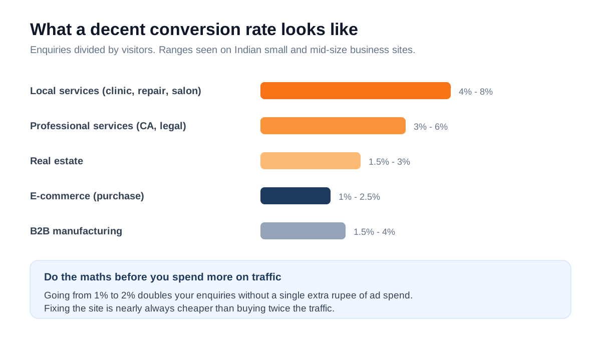
Run your own number now: open Analytics, take last month's visitors, count the enquiries you actually received, divide. Most owners have never done this and are surprised by the answer.
Here is why it matters more than traffic. If you get 2,000 visitors and convert 1%, that is 20 enquiries. Lifting conversion to 2% gives you 40 - the same result as doubling your ad spend, except it costs nothing every month afterwards. Conversion work is a one-time cost with a permanent return, which is why we do it before recommending anyone increase their budget.
The first ten seconds
Most visitors decide whether to stay in under ten seconds. Four things carry that decision.
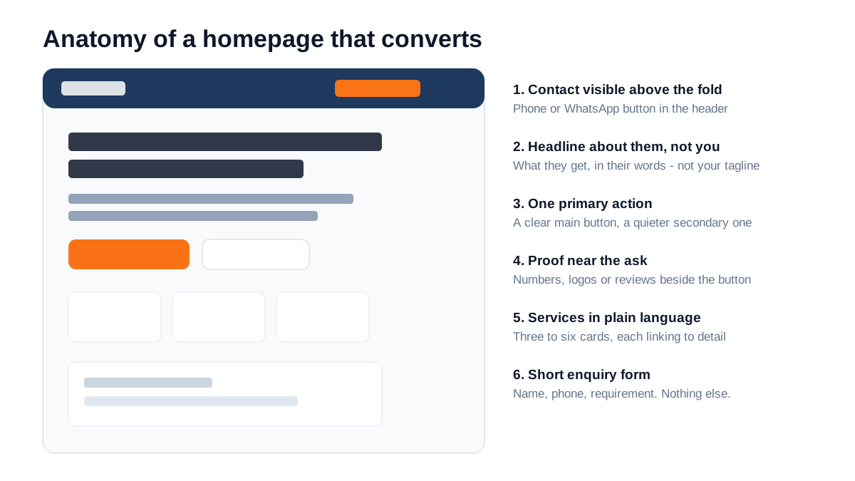
1. A headline about them, not you
'Welcome to Sharma Enterprises - Excellence Since 1998' tells a visitor nothing they can use. They do not yet care about your history; they care whether you solve their problem.
Rewrite it as what they get: 'Same-day AC repair across Kanpur - technician at your door in 90 minutes.' Specific, useful, and it answers the question they arrived with.
A test that works: cover your logo and read the headline. If it could belong to any competitor, it is not doing its job.
2. One obvious next step
Confused visitors do nothing. If your header has Call, WhatsApp, Get Quote, Book Demo and Download Brochure competing at equal weight, you have not given a direction - you have given a menu.
Choose one primary action, make it visually loudest, and repeat it down the page. Give the secondary action a quieter, outlined style. In India, WhatsApp usually outperforms a form by a wide margin because it feels like less commitment - a conversation rather than a submission.
3. A tappable phone number
This sounds too basic to mention, and we still find it on roughly a third of the sites we audit. If the number is an image, or plain text without a tel or WhatsApp link, mobile users have to memorise it and switch apps. Many will not.
Make it a real link, put it in the header, and repeat it at the end of every section a visitor might finish reading.
4. Clarity about what you actually do
Vague positioning kills more enquiries than bad design. 'Complete business solutions' means nothing. 'GST registration, ITR filing and bookkeeping for small businesses' tells someone in one line whether to keep reading.
List your services as separate, named items - each linking to its own page. This helps conversion and, as a bonus, gives search engines something specific to rank. It is the same principle behind how we structure service pages.
Trust is what people are really looking for
Someone landing on your site from an ad has no reason to believe you. Every trust element you add reduces the risk they feel.
5. Proof placed next to the ask
Testimonials buried on a separate page do almost nothing. Proof works when it sits beside the decision - a short client quote next to the enquiry form, a number under the main button, logos below the headline.
Specific beats glowing. 'Great service, highly recommended' is filler. 'They rebuilt our site and enquiries went from 8 to 30 a month' is evidence. If a client says something specific, ask permission and use their exact words.
6. Real photos of real people
Stock photos of models in headsets signal that there is nothing real to show. Photos of your actual team, premises, vehicles or completed work signal a business that exists.
This matters disproportionately in India, where a large share of buyers are still deciding whether an online business is legitimate at all. A photograph of your shopfront does more for trust than three paragraphs of copy.
7. A visible address and a real human
Full address, city, pincode and a working phone number in the footer of every page. Add a photo and name of the person who answers enquiries if you can. Anonymous businesses feel risky, and risk is the main reason people close a tab.
This also feeds directly into local search - the same details that build trust with visitors build consistency signals for Google, which we covered in the local SEO playbook.
8. Prices, or at least ranges
The most common objection we hear is that publishing prices lets competitors see them. Your competitors already know. The people you are hiding prices from are customers.
Hidden pricing has a cost: the visitor assumes it is expensive, or assumes a sales call is required, and leaves. Even a range - 'websites from Rs 25,000' or 'SEO plans start at Rs 12,000 a month' - filters out unsuitable enquiries and increases the quality of the ones you get. We publish ours for exactly this reason.
Speed, mobile and the actual ask
9. Speed, measured properly
Over 75% of Indian web traffic is mobile, often on a moving connection. A site that loads in two seconds on office wifi can take eight on 4G in a lift.
Google measures this through Core Web Vitals, and it is both a ranking factor and, more importantly, an abandonment factor.
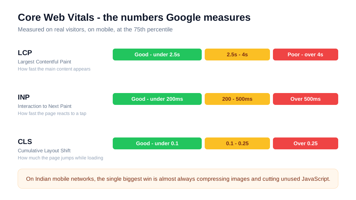
The fixes that produce most of the gain, in order:
- 1Compress images. Uncompressed photos are the single biggest cause of slow Indian business sites. Serve WebP or AVIF and size them to what is actually displayed - a 4,000px photo in a 400px slot wastes 90% of the download.
- 2Lazy-load anything below the fold. Images further down should load as the visitor scrolls, not upfront.
- 3Cut unused scripts. Every chat widget, popup tool and analytics tag adds weight. Audit them and remove what nobody looks at.
- 4Set width and height on images. This prevents the layout jumping while things load, which is what CLS measures - and what makes people tap the wrong thing.
- 5Use decent hosting. Rs 200-a-month shared hosting has a real cost, and it shows up in your server response time.
10. A mobile experience designed for thumbs
Responsive is not the same as usable. Check on a real phone: are buttons at least 44 pixels tall? Is body text 16px or larger so nobody has to pinch? Does the menu work one-handed? Is anything important hidden behind a hamburger that should not be?
One detail worth singling out: on mobile, put your phone or WhatsApp button where a thumb naturally rests - low on the screen, not tucked in a top corner.
11. A form short enough to finish
Every field you add reduces completions. The relationship is brutal and well documented - going from three fields to seven can halve your submissions.
For a first enquiry you need name, phone and a one-line requirement. That is it. Email is optional. GST number, company size, budget range and how-did-you-hear-about-us can all be asked in the conversation that follows. You are not qualifying a lead yet - you are starting a conversation.
Also: say what happens next. 'We reply within 4 working hours' reduces the anxiety of sending details into a void.
12. Working conversion tracking
This one is invisible to visitors and decides everything else. Without tracking you cannot tell which page, ad or keyword produced an enquiry, so every optimisation decision is a guess.
Set up Google Analytics 4 with events for form submissions, phone taps and WhatsApp clicks. Connect Search Console. If you run ads, import those conversions so the platforms optimise towards enquiries instead of clicks. Roughly a third of the accounts we audit have tracking that is missing, duplicated or firing on page load - which is worse than none, because it produces confident wrong answers.
A 30-minute audit you can run today
Open your site on your phone, on mobile data, and work through this honestly:
- 1Time the load. Over four seconds is a problem worth money.
- 2Read only the headline. Does it say what you do and for whom?
- 3Tap the phone number. Does it dial?
- 4Find the primary action. Is there exactly one obvious thing to do?
- 5Count the form fields. More than four for a first enquiry is too many.
- 6Look for proof above the fold. Any reviews, numbers or logos?
- 7Check the footer. Full address and phone on every page?
- 8Search for a price. Can a visitor find any indication of cost?
- 9Scroll fast. Does the layout jump while images load?
- 10Submit the form yourself. Did the enquiry actually arrive, and did anything confirm it to you?
Every 'no' on that list is a leak. Most of them are an afternoon of work, not a rebuild.
Before spending more on traffic, fix the page it lands on. Doubling your ad budget doubles your cost. Doubling your conversion rate does not.
The pages you need, and what belongs on each
Most small business sites have either too few pages to rank for anything, or thirty pages nobody reads. This is the structure that works for a typical Indian service business.
Home. Its only job is to answer three questions in the first screen: what you do, who it is for, and what to do next. Then services, proof, and an enquiry option. Do not try to explain everything here - send people to the right page instead.
A page per service. This is the one most businesses skip, and it costs them twice. Search engines have nothing specific to rank, and ad traffic lands somewhere generic. Each page should cover what the service includes, who it suits, what it costs or starts at, how the process works, and two or three relevant questions. This is exactly why our own services are split into individual pages rather than one long list.
Pricing or packages. Even ranges. This page usually receives some of the highest-intent traffic on the whole site, because people who look at pricing are people considering buying.
About. Not your company history - the reason someone should trust you. Team photos, years of experience, the specific kinds of clients you serve, credentials if you have them. This page does more conversion work than owners expect, because it is where hesitant buyers go before enquiring.
Case studies or portfolio. Proof with numbers attached. Even three short ones outperform a page of adjectives.
Contact. Address, map, phone, WhatsApp, a short form and your working hours. Nothing else.
A blog, if you will actually maintain it. An abandoned blog with three posts from 2023 signals a dormant business. Either publish something useful every month or two, or leave it out.
Answer the objections the page is causing
Every visitor who does not enquire has a reason. They rarely tell you, and it is almost always one of five things. Good pages answer them before they are asked.
'Is this business real?' Answered by real photos, a full address, a named person, a working phone number, and reviews with dates.
'Can they actually do my specific thing?' Answered by service pages that name the specific thing, and examples from a similar business or industry. A generic 'we do everything' page answers this badly.
'What will this cost me?' Answered by a price, a range, or at minimum a clear explanation of what determines the price. Silence here is interpreted as expensive.
'What happens if I fill this form?' Answered by telling them - who calls, how soon, and whether it is a sales pitch or a conversation. 'We reply within 4 working hours, no obligation' removes more friction than another testimonial would.
'Why you and not the cheaper option?' Answered by being specific about what you include that others do not - response time, ownership of accounts, reporting, warranty. Vague quality claims do not answer this; concrete inclusions do.
Write those five questions down and walk your homepage looking for each answer. Anything you cannot find in ten seconds is a leak you can plug with a paragraph.
If you only have one weekend
Fix things in this order. It is roughly descending by return on effort.
- 1Make the phone number and WhatsApp tappable and put them in the header. Fifteen minutes, immediate effect.
- 2Rewrite the headline to say what you do, for whom, where. Half an hour.
- 3Cut the enquiry form to three fields. Ten minutes, often the single biggest jump.
- 4Compress every image and add width and height attributes. An hour, and it fixes both speed and layout shift.
- 5Add three specific testimonials near the primary button. An hour, including asking clients.
- 6Put the full address and phone in the footer of every page. Fifteen minutes, helps trust and local search together.
- 7Set up conversion tracking so you can measure whether any of it worked. An hour, and without it you are guessing.
That list is a weekend of work, no redesign, no developer for most of it. In our experience it moves conversion rate by half again on a typical neglected site - which, on 2,000 monthly visitors, is the difference between twenty enquiries and thirty.
Frequently asked questions
How much does a good business website cost in India?
A solid five-page business site runs roughly Rs 15,000 to Rs 40,000, and a larger custom site Rs 40,000 to Rs 1,50,000. What matters more than the build cost is what it does afterwards - a cheaper site that converts at 4% beats an expensive one converting at 1%. We broke the full picture down in our guide to digital marketing costs in India.
Do I need a new website or just fixes?
If the structure is sound and it loads reasonably, fixes usually get you most of the way - headline, call to action, form length, proof and images can transform performance in a week. Rebuild when the site is not mobile-friendly, cannot be edited without a developer, or is built on something so old that fixing it costs more than starting again.
Should I use WordPress, Wix, Shopify or a custom build?
For a simple brochure site with a small budget, a well-configured WordPress or Wix site is perfectly fine. For an online store, Shopify or WooCommerce. Custom builds make sense when speed matters commercially, you have unusual functionality, or you are integrating with a CRM or internal systems. The platform matters far less than the execution.
How long does it take to see results after fixing conversion?
Almost immediately, which is what makes it the best-value work available. Conversion changes affect the traffic you already have - you often see a difference within one to two weeks, unlike SEO which takes months.
Is a chat widget or WhatsApp button better?
In India, WhatsApp, comfortably. It is familiar, keeps a record on the customer's own phone, and lets them reply later. The one requirement is that somebody answers it quickly - an unattended WhatsApp button is worse than none.
How many pages should a small business website have?
Five to eight covers most businesses: home, about, services (with a page per major service), pricing or packages, and contact. A page per service is worth the effort - it gives you something specific to rank and something specific to send ad traffic to.
The bottom line
A website is not a brochure and it is not a design project. It is a salesperson that works every hour of the day, and most of them are doing a poor job because nobody has checked whether they can actually be understood, tapped, trusted or completed on a phone.
You do not need a redesign to fix that. Start with the headline, the phone link, the form length and the images. Measure the conversion rate before and after. Then decide whether more traffic is really the thing you are short of.
Want us to look at your site?
We will run through the same audit above on your website and tell you the three changes likely to move your enquiry numbers most - whether or not you work with us.
You can see how we build and price sites on our website development page, compare complete plans on the packages page, or send us your URL and we will take a look.